
In the art of graphic design, the font you choose wields more power than you might think. From the crisp headers of a corporate report to the bold letters emblazoned on a newspaper banner, the right graphic typeface can elevate your message and solidify your brand identity. Our journey through the impact of typeface selection unveils how psychological factors influence audience perception, the intimate tie between font and brand image, and best practices to avoid common pitfalls. Understand through real examples how the strategic use of space and typography drives design success. Whether you’re a budding designer or a seasoned artist, mastering font selection can be your game-changer in creating visuals that resonate.
Key Takeaways
- Typeface choice can significantly affect audience perception and brand identity
- Legibility and functional communication are paramount in typography for graphic design
- Consistent use of typefaces across platforms strengthens brand recognition and user experience
- Decorative fonts should be used sparingly to maintain clarity and visual impact
- Strategic typeface selection can transform brand engagement, as exemplified by Mailchimp and Airbnb
Understanding the Role of Typefaces in Graphic Design

The selection of a typeface is a crucial element in graphic design, carrying the potential to influence both comprehension and perception. Addressing the basics of typography in visual communication reveals that fonts can traverse the boundary of mere text to convey emotions and brand personality. A deep dive into this domain uncovers the nuance each style, such as Didone or Arial, lends a design. Designers must consider the color and graphics in tandem with typeface choice to succeed in their visual endeavors. Acknowledged experts like Adrian Frutiger have underscored the importance of understanding this interplay, as typefaces can make or break the effectiveness of a design.
The Basics of Typography in Visual Communication
In the sphere of visual communication, typography acts as a silent ambassador, exemplifying clarity and engagement for every poster or web page it graces. A proficient illustrator acknowledges the strength of a well-chosen serif or sans-serif typeface; for instance, the stroke variation in a serif font can afford a touch of elegance, while a sans-serif font like Arial embodies modernity and accessibility. Balancing functionality with aesthetic appeal, web typography must prioritize readability, especially when considering vast audiences and diverse digital platforms. Mastery over these typographic elements ensures a graphic designer wields their pen with precision, channeling the intended message with optimal impact.
How Fonts Communicate Beyond Written Words
The interplay between different fonts in graphic design often ventures into subtleties that go beyond the traditional composition of messages. Consider the historical richness of typefaces crafted by American Type Founders, which can imbue a design with a classic, ageless aura, speaking of heritage and reliability. On the other hand, modern free font bundles sourced from a reliable free fonts website offer accessibility and freshness, aligning with contemporary aesthetics and the spirit of innovation. In such decisions, graphic designers must keenly select typefaces that resonate not only with the content’s literal message but also with the underlying tones and values the brand aspires to communicate.
The Influence of Typeface Styles on Design Perception
In web design and advertising, the selection of a typeface significantly dictates the customer’s perception and interaction with the content. For instance, a font that mimics handwriting can add a personal, artisanal touch to a brand, while a bold, blocky typeface may be chosen to convey strength and professionalism. The judicious use of typography, considering aspects like readability, ensures that the design is not only aesthetically pleasing but also functionally effective in communication.
It is not simply about the visual appeal; typography in graphic design plays a pivotal role in guiding user behavior and reinforcing the message. A well-executed typeface choice can lead to increased engagement and readability, making the content more accessible and enjoyable, thus cultivating a positive user experience:
- A serif font, known for its traditional look, might suggest trustworthiness and authority.
- San-serif fonts offer a cleaner and more modern vibe, suitable for tech-oriented web design.
- Typography that mirrors handwriting can lend authenticity, ideal for brands wishing to appear handcrafted and unique.
Psychological Impact of Typeface Choices

Typeface choices in graphic design directly affect audience perception, trigger emotional responses, and carry cultural significance that can enhance or detract from a brand’s messaging. Incorporating fonts like Univers or Franklin Gothic within the design hierarchy can elevate a magazine’s visual impact, ensuring accessibility and resonance. This section examines how specific typefaces can stir emotions or denote particular eras or locales, informing readers’ psychological engagement with the content.
How Fonts Affect Audience Perception
The judicious selection of typefaces such as Baskerville or Bodoni in graphic design can profoundly influence audience perception, shaping how a brand is received. Integrating Avenir with meticulous kerning enhances readability and modernity, suggesting innovation and precision in the brand’s identity. These typographic choices not only aesthetically please but also connect with users on a subconscious level, contributing to the brand’s overall success.
- Baskerville often imbues a sense of respectability and credibility to the text.
- Bodoni, with its sharp contrast in stroke weight, can provide a luxurious and dramatic feel.
- Avenir, known for its clean and modern look, often aligns with forward-thinking brands.
- Well-executed kerning ensures legibility, which in turn, supports the brand’s promise of attention to detail.
Emotional Responses to Different Typeface Styles
The emotional landscape of visual communication is profoundly shaped by typographic choices. A calligraphy-inspired typeface might evoke a sense of tradition and elegance, while blackletter fonts can summon the gravity and formality of historical documents. It is no accident that typefaces derived from the work of Claude Garamond are frequently used in publishing; their classic and readable design establishes a serious tone infused with scholarly authority. Slab serif fonts, with their block-like serifs, can juxtapose a modern, sturdy character against a backdrop of stability and reliability. These emotive nuances underpin the importance of selecting the right typeface to align with the psychological expectations and cultural contexts of the audience.
- Calligraphy invites a personal touch, reminiscent of handcrafted artistry.
- Blackletter offers a strong historical association, often used to evoke antiquity.
- Typefaces influenced by Claude Garamond suggest academic prowess and integrity.
- Slab serif selections impose a sense of stability and confidence in visual communication.
Cultural Significance of Specific Fonts
The cultural significance of specific fonts cannot be overstated in the realm of designer typography. When designers apply a typeface such as the distinguished creations of Giambattista Bodoni, they pay attention to the type’s historical and cultural resonance, allowing the visual hierarchy in a project to speak to more than just the aesthetic senses. The Bodoni font, with its fine serifs and high stroke contrast, lends an air of sophistication that evokes the elegance of 18th-century classicism, commanding respect and exuding a timeless quality in the field of visual communication.
Typeface Selection and Brand Identity

In the domain of graphic design, typeface selection is pivotal to brand identity, requiring fonts like Futura to align seamlessly with brand personality. The strategic use of graphic tee fonts and distinct design typography ensures consistency across brand materials, offering a recognizable visual language for consumers. With unique type design implementation, brands can distinguish themselves in a crowded market. These elements together underscore the essence of typographic decisions in establishing and reinforcing a strong brand presence.
Aligning Font Choices With Brand Personality
Aligning font choices with brand personality is integral to establishing a cohesive identity. The sturdiness of Rockwell suggests confidence, making it fitting for a brand aiming to portray reliability. On the other hand, a typeface like John Baskerville, with its sharp stroke contrast and refined serifs, offers an air of sophistication ideal for luxury brands. For body text where legibility is paramount, selecting a font that pairs readability with character allows for ease of reading while reinforcing the brand’s identity.
Ensuring Consistency Across Brand Materials
Ensuring uniformity in fonts and graphics across all brand materials is essential for forging a strong visual identity. For example, a corporation that employs the classic Times New Roman in its official correspondence demands authority and tradition, thus requiring the same degree of emphasis throughout various platforms to maintain corporate identity. Such graphic fonts, when consistently integrated, create a cohesive brand experience that reinforces recognition and trust among the target audience. A graphic art font chosen for its readability and professional appearance, like Times New Roman, can uniformly convey a brand’s ethos, whether it appears in print, on web pages, or within mobile applications.
Standing Out With Unique Typeface Integration
Integrating a distinctive display typeface into a brand’s logo and design elements sets a company apart, fostering unique communication that resonates with the target audience. A carefully selected font from a respected foundry can define a brand’s voice and visual identity; when used consistently, it becomes a powerful tool for brand recognition. In the competitive realm of design, original font choices command attention and amplify the brand’s message, underscoring its individuality within the marketplace.
In crafting a brand’s visual identity, the use of a unique typeface not only enhances design but also strengthens brand recall. For instance, a bespoke typeface developed by a reputable foundry for a tech company’s logo could embody innovation and modernity, signaling to users the company’s cutting-edge position in the industry. Such strategic font integration serves as a vital bridge between the brand and its audience, carving a niche for the company in a crowded field:
Best Practices for Choosing Typefaces in Design Projects
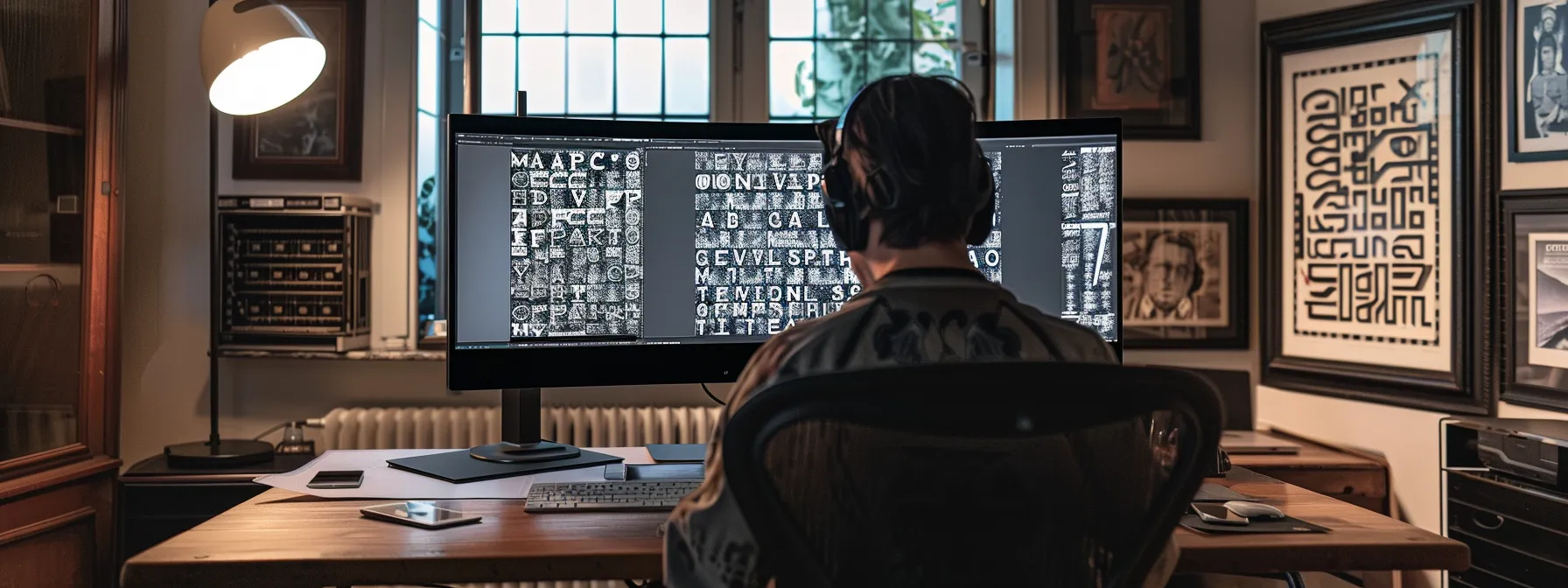
Choosing the right typeface is integral to the success of any design project, necessitating a consideration of purpose and audience. Designers must navigate between the appeal of aesthetics and the imperative of readability, especially when choosing fonts like Helvetica, designed by Max Miedinger and a staple of the type foundry legacy of professionals like Morris Fuller Benton. The effective pairing of multiple fonts, particularly in headlines, underpins the conveyed message, while testing across various mediums ensures consistency. This section provides key practices for font selection, offering insights into the methodology behind impactful typography.
Defining the Purpose and Audience of the Design
Understanding the purpose and recognizing the target audience are the bedrock principles when selecting typefaces for design projects. A design tailored for corporate reports, with an emphasis on professionalism and readability, would benefit from a typeface embodying austerity and clarity. Meanwhile, a brand aiming to attract a youthful demographic must blend aesthetics with playful accessibility, choosing fonts that express vivacity without sacrificing legibility. Reflecting the mission of the content through judicious font selection plays a pivotal role in graphics, ensuring messages resonate authentically with the intended audience.
Balancing Aesthetics With Readability
In the intricate field of graphic design, striking an equilibrium between aesthetics and readability is paramount. A typeface’s visual appeal must not overshadow its primary function of communication, compelling designers to select fonts that are both attractive and legible across various contexts and devices. Expert designers often recommend a blend of timeless typefaces with contemporary counterparts to achieve this balance, ensuring the text is not just a treat for the eyes but also effortlessly consumable by the reader.
Effective Pairing of Multiple Fonts
The art of effectively pairing multiple fonts hinges on the harmonious balance between contrast and coherence. Design professionals harness this technique to draw attention and create hierarchy, judiciously combining a robust display font with a subtle sans-serif for body text to guide the reader’s eye while ensuring a unified aesthetic. The proper blend amplifies both the message’s impact and the design’s visual integrity, ultimately contributing to a successful graphic composition.
Testing Fonts Across Different Mediums
Testing typefaces across different mediums is a critical step in ensuring coherent visual communication. Designers must assess the legibility and impact of fonts on print materials, digital displays, and mobile interfaces to maintain brand consistency. This ensures the typeface chosen performs well in diverse applications, from the textures of printed brochures to the varying screen resolutions of smartphones and tablets. Understanding the appropriate application of typefaces across mediums caters to better user experiences and reinforces brand identity:
Common Pitfalls in Typeface Selection

While typeface selection is integral to design success, common pitfalls such as overusing decorative fonts, neglecting legibility at varying sizes, ignoring accessibility, and inconsistent font usage can undermine effectiveness. These missteps affect not only the aesthetics but also the functionality of design, potentially impairing reader engagement. Addressing these areas is key to delivering a coherent visual message that aligns with user needs and brand identity. The subsequent content will explore practical strategies to avoid these common errors.
Overusing Decorative Fonts
Excessive reliance on decorative fonts is a common error that can sabotage the success of graphic design. This tendency often results in visual clutter, detracting from the message’s clarity and the design’s functionality. Graphic designers, by maintaining a strategic approach to typography, can ensure that the typefaces used fortify the design’s objectives, rather than overwhelm. Understanding when to employ decorative fonts sparingly is integral to creating clear and impactful visual communication that enhances rather than hinders the user experience.
Neglecting Legibility in Different Sizes
Neglecting the legibility of typefaces at varying sizes is a critical oversight that can greatly diminish the effectiveness of graphic design. The clarity with which text can be read on different devices and in print materials is vital for user comprehension and satisfaction. By prioritizing legibility in design decisions, professionals ensure that their typography is not only visually striking but also functional across all platforms and sizes:
- Choose fonts that maintain clarity when scaled down for mobile screens.
- Select typefaces that are readable in print without causing strain over extended reading periods.
- Test legibility by emulating various viewing situations and adjusting typeface and size accordingly.
Ignoring Accessibility Considerations
Ignoring accessibility considerations in typeface selection can significantly limit a design’s inclusivity and effectiveness. Professional designers must be mindful of individuals with visual impairments by choosing fonts that are legible for readers with diverse needs. Failing to account for aspects like contrast, font size, and character shapes not only neglects a segment of the audience but also diminishes the overall impact of the design, as it hinders clear communication and can inadvertently convey a message of exclusivity.
Inconsistent Font Usage
Inconsistent font usage in graphic design projects can significantly disrupt the coherence and effectiveness of visual communication. When designers alter typefaces haphazardly across different elements, it not only confuses the audience but also weakens the brand identity. Professional graphic designers understand that maintaining a consistent typographic approach is essential for instilling brand recognition, ensuring that every piece of content contributes to a harmonious, unified brand experience.
Real-World Examples of Successful Typeface Use

Examining real-world examples offers practical insights into the pivotal role of typeface selection in graphic design. From a brand’s metamorphosis through thoughtful typography to enhanced user engagement credited to deliberate font decisions, these case studies illuminate the direct connection between type choice and design efficacy. The following sections delve into the transformational power of typography within notable projects, providing valuable lessons from the field that underscore the gravity of typeface selection for branding success.
Case Study: A Brand’s Transformation Through Typography
The transformative impact of typography on brand identity is exemplified by Mailchimp’s rebranding initiative, which ushered in a distinctive, custom typeface that became central to the brand’s visual language. The shift to a warmer, more approachable font reflected Mailchimp’s commitment to friendliness and accessibility, fundamentally altering how customers perceived the email marketing platform. This strategic typographic evolution not only rejuvenated Mailchimp’s brand image but also demonstrated the substantive role of typeface selection in enhancing brand recognition and user engagement.
How Typeface Choice Improved User Engagement
The choice of typeface played a pivotal role in Airbnb’s brand overhaul, directly contributing to improved user engagement. By transitioning to a custom typeface, Airbnb Cereal, the company established a more cohesive and identifiable brand experience across its web and mobile platforms. The modern and approachable design of the font immediately resonated with users, facilitating easier reading and navigation, which in turn, led to a more seamless and inviting user interface that encouraged prolonged interaction with the brand’s content.
Lessons From Notable Design Projects
Notable design projects demonstrate that strategic typeface selection can be transformative for brand identity and user experience. The London Underground’s clear and distinct Johnston typeface, for example, exemplifies how functional, recognizable lettering aids navigation and communicates a consistent, reliable service. The unique typeface became synonymous with the city’s public transport, reinforcing the importance of matching type design to practical application and cultural context, ultimately enhancing brand affinity and public usability.
Conclusion
Typeface selection is a critical component in crafting a successful graphic design, as it shapes audience perception, communicates brand identity, and drives user engagement. Strategic use of typography has the power to evoke specific emotions and cultural connections, enhancing the message and ensuring that it resonates with the intended audience. Consistency in typeface across various mediums fortifies brand recognition, while accessibility in typography broadens audience inclusivity. The profound influence of typeface on the success of a design underscores its role as not just a tool for visual aesthetic, but a cornerstone of effective communication.